Ephemeral UI: a workday that changes with you
A schedule-led app that reshapes around meeting prep, action items, calls, and reflection. Explore the Ephemeral UI demo and the visible math behind its choices.
At 8:30, I want to prepare for a meeting. At 10:00, I want to be in the conversation. By the afternoon, I need to follow up, make calls, and move the work forward. In the evening, I might want to read and reflect.
Why should all of those moments start with the same dashboard?
That is the question behind Ephemeral, a design system and interactive study of interfaces that gather around the task at hand.
Try the Ephemeral workday demo →
What I mean by ephemeral UI
An ephemeral UI is a temporary arrangement of familiar components, shaped around a current need. The view can appear, help someone finish something, and then leave. The underlying work stays.
For this study, adaptation means choosing and combining existing components. An agenda editor still behaves like an agenda editor. A call queue still looks like a call queue. The change is which pieces appear together, and which task gets the space.
I wanted to explore this without requiring someone to write a prompt every time they open an app. Sometimes a schedule and a few preferences already provide a useful starting point.
One workday, five different needs
The example app is Daybook. It uses a fictional schedule, sample documents, action items, contacts, and reading material.
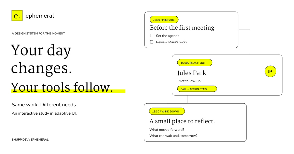
- 08:30 — Prepare. Bring forward the next meeting, an arrival time, the agenda, and other people’s work to review. A 09:00 meeting with 12 minutes of travel and a five-minute buffer means leaving by 08:43.
- 10:00 — Meet. Put the meeting room, notes, and action capture within reach. Earlier follow-ups can sit alongside the conversation when they remain relevant.
- 12:30 — Follow through. Show the decisions as action items with owners and due times, plus a follow-up draft to review.
- 15:00 — Reach out. Bring together the call queue, contact context, and outstanding meeting actions. The person you need to call may also be waiting for something you promised earlier.
- 19:30 — Wind down. Make room for reading and a small reflection: what moved forward, and what can wait?
There is also a fixed calendar view for comparison. The records stay familiar; the adaptive view changes what you can do with them immediately.
Sometimes the right answer is a combination
A clean separation between “meetings” and “calls” can hide a useful connection. If an afternoon call concerns a decision from the morning, keeping the action item beside the contact context makes sense.
In the demo’s untouched 15:00 sample, outreach gets 58.3% of the normalized score share and follow-ups get 34.2%. Those needs are compatible, so the view combines a call queue, contact brief, and action list.
The rule allows a compatible runner-up to contribute when its share reaches 25%. The composition uses at most three unique components. That limit is a design choice to keep the workspace focused, not a research finding.
Show the guess, including the math
Below the app, System One exposes the assumptions behind the suggestion. That name describes this demo’s rule system. It is not a claim about human cognition or an AI model.
Each candidate need receives three signals between zero and one:
- Timing: how close a meeting or preferred time window is.
- Open work: the fraction of relevant items still needing attention.
- Sample habits: an authored preference strength for that part of the day.
The default score is:
score = 3 × timing + 2 × open work + 1 × sample habitsFor outreach at 15:00, that is 3 × 1 + 2 × 1 + 1 × 0.95 = 5.95. For follow-ups, it is 3 × (5/6) + 2 × 1 + 1 × 0.65 = 5.15.
The page converts all five scores into shares using:
share(i) = 100 × exp(score(i) / 1.5)
           / sum(exp(score(j) / 1.5) for every candidate j)
These percentages are illustrative shares, not measured confidence or calibrated probabilities. You can change the weights, disable sample habits, complete work, and inspect how the result changes. Equal top scores fall back to the calendar.
Adaptation needs boundaries
A useful suggestion still needs an override. You can explicitly choose the workspace you want without changing the scores underneath it.
The layout also stays in place while you edit. When changing work produces a different suggestion, the app offers it for you to apply. Otherwise, completing a task could make the next control disappear under your hand.
“Done for now” releases the temporary view. Agendas, notes, actions, and reflections remain during the page visit. Refreshing resets this prototype.
A design system you can recognize
Ephemeral Canary uses black, white, neon canary yellow, a one-pixel line, flat surfaces, and Martel paired with Nunito Sans. Yellow marks selection and action. Recognizable cards, avatars, switches, and editors give each task a form.
The page includes six interactive component specimens and downloadable design tokens, alongside the workday study. The approved look is also saved as a reusable design skill.
This is a scripted prototype. It uses authored data and deterministic rules: no model inference, live calendar, actual calls, or sent messages. That makes it possible to inspect the interaction idea before paying to run a model behind it.
The question I want to test is whether these changing combinations help someone get to the next useful action with less navigation, while preserving enough stability to feel familiar.
Explore the components, try the workday, or inspect System One’s math.
Connections
Notes linked from this one